
The rule of thirds says that most designs can be made more interesting by visually dividing the page into thirds vertically and/or horizontally and placing our most important elements within those thirds."
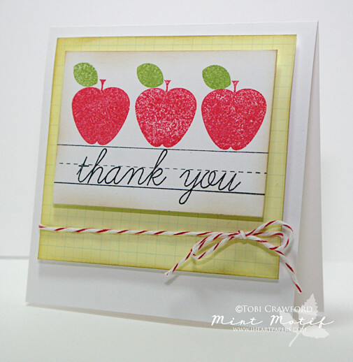
Also, using three elements, or multiples of three is pleasing to the eye. On this card I employed a few different "Rule of Thirds" guidelines: number of elements, number of images, placement of images... It's fun to play around with this rule and after a while you find your work just naturally falls into the rhythm of three..

Here's another images using 3 elements, and, I placed the pink panel on the left third of the card, and the banner is on the lower third of the pink panel AS WELL AS the whole card itself..
Thanks for stopping by!
Card #1: (all supplies linked are from i {heart} papers)
| Stamps: Mint Motif - School Basics |
| Paper: pink paislee "Hometown Summer", bazzill, papertrey ink |
| Ink: memento (black green, and red) |
| Accessories: baker's twine - cherry red |
Card #2:
| Stamps: technique tuesday- Amazing by Ali Edwards, and Harlequin Harmony |
| Paper: PTI |
| Ink: pti fresh snow, and Memento black |
| Accessories: Prima flower; nestabilities |

1 comments
Love these so much Tobi!
ReplyDeleteThank you for commenting!