Ever since I purchased my Pentax K110d digital SLR I have become, not OBSESSED, but interested in photography, and how I can get the most out of my entry-level body. (the camera, not my own body, just in case you were confused..) I want to show you how you can get your SOOC (straight out of camera) shots to look a little more well-shot and have a little more of that professional look. I said a little, because most of my shots aren't magazine quality, but I luck out sometimes..
I started out with Photoshop Elements which helped me edit photos a little more specifically than I ever did, and it allowed me the freedom to play around. I watched tutorials online and they were always so helpful, but everyone was always using the professional version of Photoshop, CS3, or the newer CS4. Well finally I gained access to a copy through my school, and I've been able to play around with "actions" and more of the manual functions of the program. With the photos I am showing you today I will be using Pioneer Woman's FREE actions found here as well as editing on my own to complete the look. Her whole photography section has helped me TONNES, so if you're at the point where you want to start learning more, read her articles, they rock!
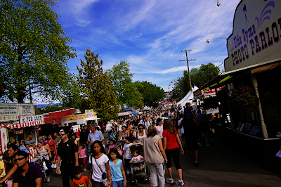
So here are some of my before and afters from yesterday's excursion to the PNE. It's BC's state fair, kinda... Animals, rides, bad food.. you know.. Click on any pic to see it larger, although some of them are still VERY large..
*edited to add: I included one more edit of the photo because I wasn't happy with it, and "B" commented that I should have lightened just under the hat. The one on the right is where I used that technique.. I used a bunch of different actions on this one to slightly lighten up his face under his hat, and alter the colours a little. Then I cropped it, and played with the colour of the sno cone so it actually showed it's greeniness.


2 comments
A nice contrast from Card-making. I liked what you did with the photos. I think I would have done the photo of Phoenix differently - I would have used the select tool for under his hat then lightened it. And increased the saturation of green on the snow cone. I definetly try and maintain the colours of the photos that I enhance if they're meant to be subtle. But it's really just a matter of opinion. Anyways, sweet entry.
ReplyDelete-B
P.S. You should totally hook me up with the school's CS4 :P
Those are awsome shots!!! Thank you for sharing.
ReplyDeleteThank you for commenting!